
Improving accessibility of Burger King kiosks | 2020
My role
I conducted the necessary research and created a new user interface, taking into account accessibility and the specific requirements of this equipment. Furthermore, I collaborated with the engineering team on ergonomic research that led to the selection of new hardware for the equipment.
Topics
- UX Research
- UI using Figma
- User testing
- Accessibility
Problem
During the project's development in 2020, there was a plan to have restaurants with only kiosks. By 2022, the first fully digital Burger King restaurant was already under construction. However, the kiosk design presented accessibility and ergonomic issues that needed to be addressed.
Objective
Update the kiosk interface, improving usability, modernizing the visual identity, and enhancing the ergonomics of the equipment to increase accessibility.
Research
Some Desk Research data
- Brazil has 45 million people with some kind of disability.
- Visual impairment is the most common, reaching 6.5 million inhabitants.
- The community of people with disabilities represents the 3rd largest economic power in the world, with the equivalent of $8 trillion a year.
Source The Accessibility Advantage: Why Businesses Should Care About Inclusive Design - Accenture.
Benchmark
Jeronimo
The establishment has a totem for the preferred group, but this totem is the same as the others. In other words, the focus is on preference for the elderly public, while disregarding the needs of blind people and those in wheelchairs.
Although the height of the totem accommodates various statures, it does not include people in wheelchairs, who are forced to request assistance at the counter.
McDonald’s
It has the highest totem among competitors. However, it offers a solution that serves children, people of short stature, and people in wheelchairs: it responsively reduces the interface by half the screen.

Quantitative
I chose to start with Burger King's own employees who were either blind or wheelchair-bound, totaling 6 employees. The second stage of the research was to understand how well the qualitative data collected represented the reality of the clients. To achieve this, a quantitative survey was conducted with Burger King's clients, which collected 224 responses.
Main results
78% of people prefer to rely on assistive technology rather than ask for help from an employee.
"I'd rather go to the counter than try to ask for help using the totem" - Blind person talking about fast food experience
What improvements or assistive technologies could help in public equipment:
- Preferred equipment installed lower.
- Headphones associated with screen readers.
- Possibility to zoom.
Furthermore, previous research and eye tracking have indicated that the kiosk was also too high for people who do not use wheelchairs.
Design + Engineering
What should be the ideal height of the totem?
To answer this question, we consulted with the engineering team. We performed calculations to determine the comfortable area of the customer's field of vision when using the totem. This area corresponded to approximately 47% of the totem's screen. In the current version of user interface important elements, such as CTAs and core products, were outside this field.
Delivery
Main changes on Hardware
- Screen reduction from 32” to 27”;
- Change in installation height;
- Less robust totem;
- Added headphone and keyboard input (similar to ATMs);
The image shows the difference in size between the previous and current totem. In detail, we can see the headphone jack input mentioned.

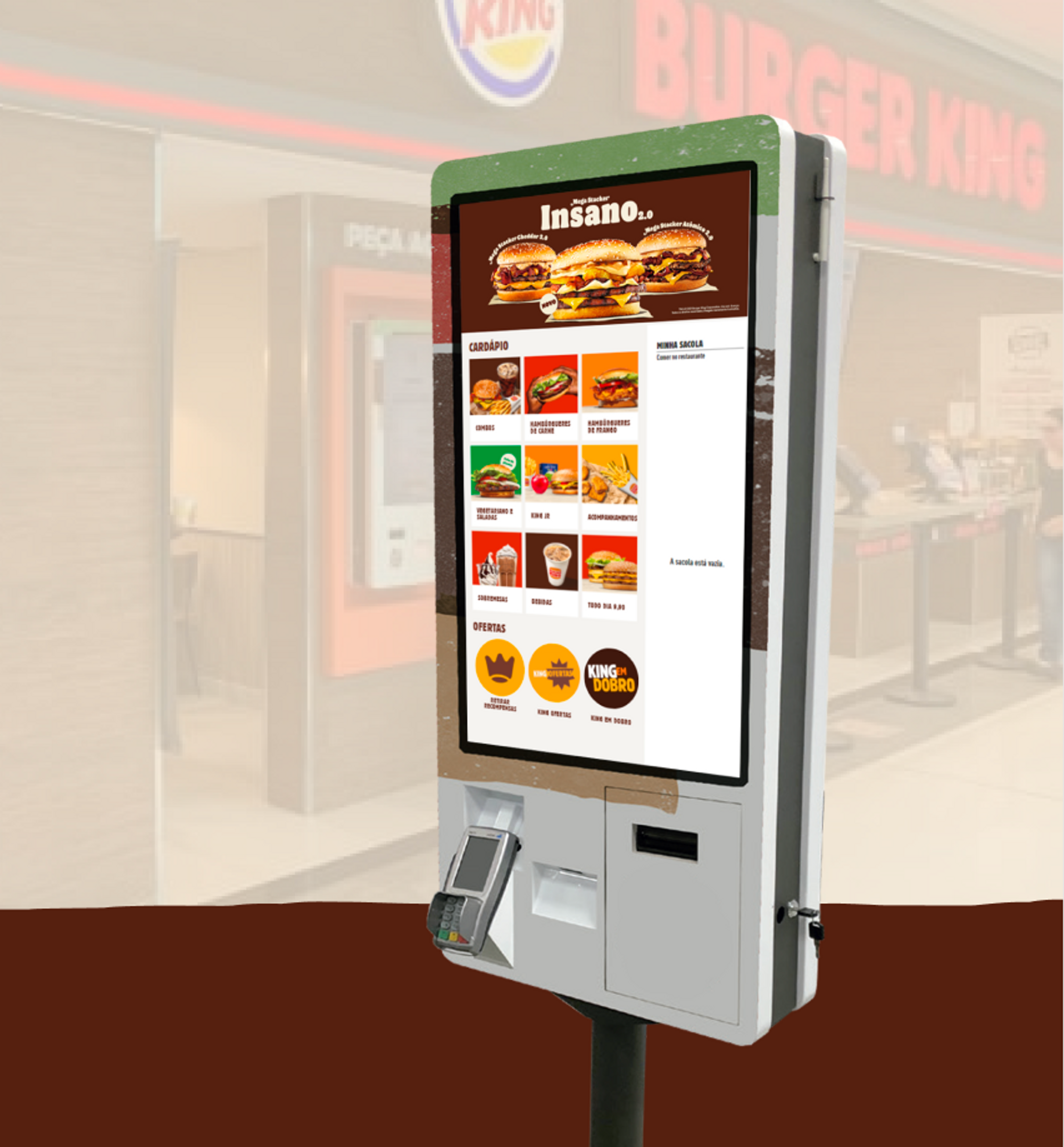
Main Changes on User Interface
- The positioning of important elements within the interface has been changed using what we call the prime area, which occupies the central 47% of the screen.
- The totem has been adapted to Burger King's new visual identity.
- Improvements have been made to color and contrast to enhance accessibility.
Me next to the new totem with the adapted interface:

Main change on user flow
Changes in the purchase navigation flow on the totem, reducing steps for the purchase and decreasing dropoff (46%) in the brand's core product category "meat sandwich”.
Through shadowing and navigation analysis on hotjar, I noticed that users choose the "meat sandwich" option and leave the screen upon realizing they cannot choose a combo (sandwich + fries + drink). In the new version, we included the combo option directly on the individual sandwich screen and gave more prominence to the "Combos" category.

Check the new UI: Prototype
Pilot stores and first results
- Decrease in average call opening for IT from 23 per month to 2 per month
- Increase in kiosk sales share by 10.5% on average in the 2 pilot stores
“Faster kiosk and customers are using it more.” - Employee at BK Granja Viana
“Maybe because it's smaller, customers prefer it, it's more delicate, I think the other one was a little scary.” - Manager at BK Av. Paulista
Next steps
- Hiring an accessibility consultancy to conduct user testing with people with disabilities;
- Update the entire park with new totems, installing a preferred totem in each store, with an accessible installation height for wheelchair users.